Photoshop Proving Ground
Cutout Filter Tricks
There are lots of tools scattered throughout Photoshop that seem to be forgotten or appear to be so specific as to have no real utility. One of those is the Cutout filter, which I pull out and dust off for the February issue of Photoshop Proving Ground.
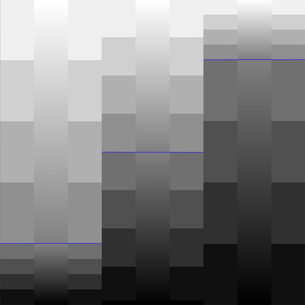
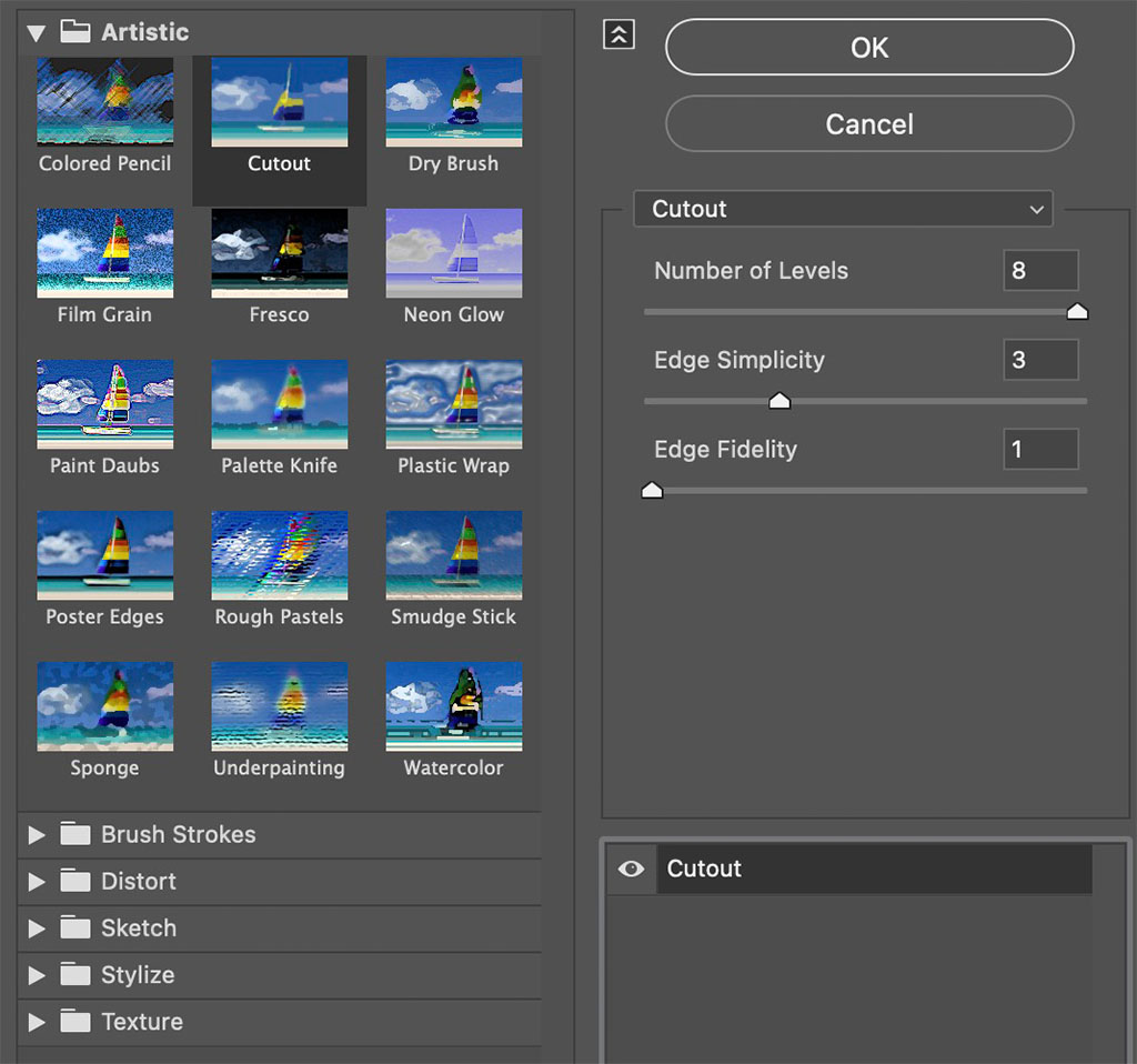
At first glance, Cutout seems to behave a lot like the Posterize adjustment, but there are some significant differences. One of those is that Cutout works on the composite image instead of individual channels. It also tries to smooth color variations into averages then applies boundaries in varying degrees. While there is a simplify control, it’s not clear how the choices are made to actually simplify borders.


This is definitely one of those filters you have to play with and then just allow for some serendipity in the process. Part of what I love about it is that there is apparent randomness thrown in. The 2022 text above isn’t something I would ever have bothered trying to draw by hand, but the filter results are actually pretty neat.
In the featured graphic, you can see how a photograph is simplified, which is a great way to get some trendy flat illustration effects for backgrounds and environments. I have a little side project going to explore using this filter for light weight illustrations such as in children’s books or graphic novels based on photographs.
If you have a novel, unexpected use for this filter, send me a note!


